A Swiss essential oils brand built from zero — identity, product design, illustrated packaging, multilingual WooCommerce store, and full digital marketing.
Olfki needed an identity that felt clean, natural, and internationally credible. We developed a wordmark logo combining geometric precision with soft organic undertones — reflecting the brand's essential oils philosophy of nature meets science.
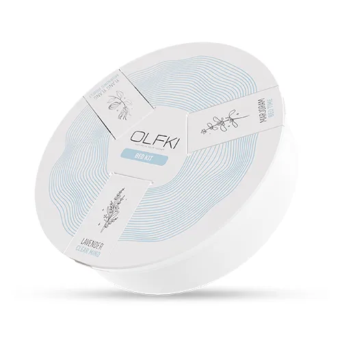
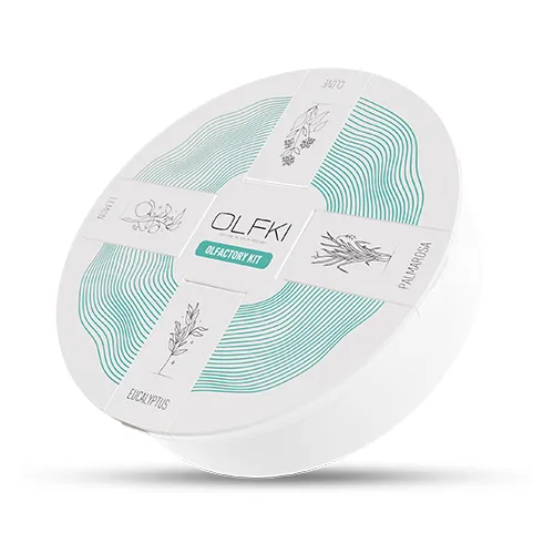
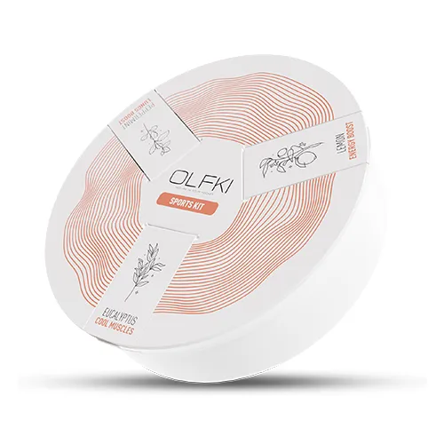
The brand colour palette drew from natural tones — soft creams, sage, and warm neutrals — designed to photograph beautifully on product packaging and digital screens alike.
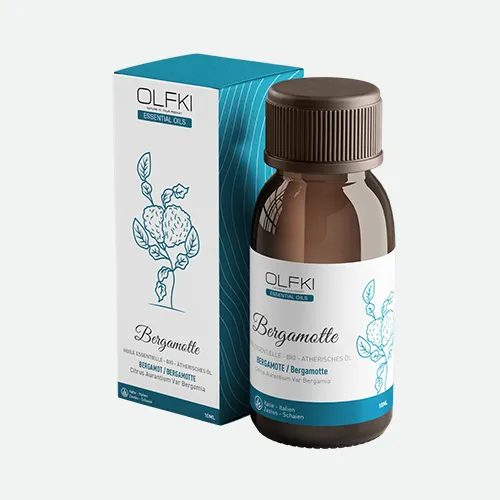
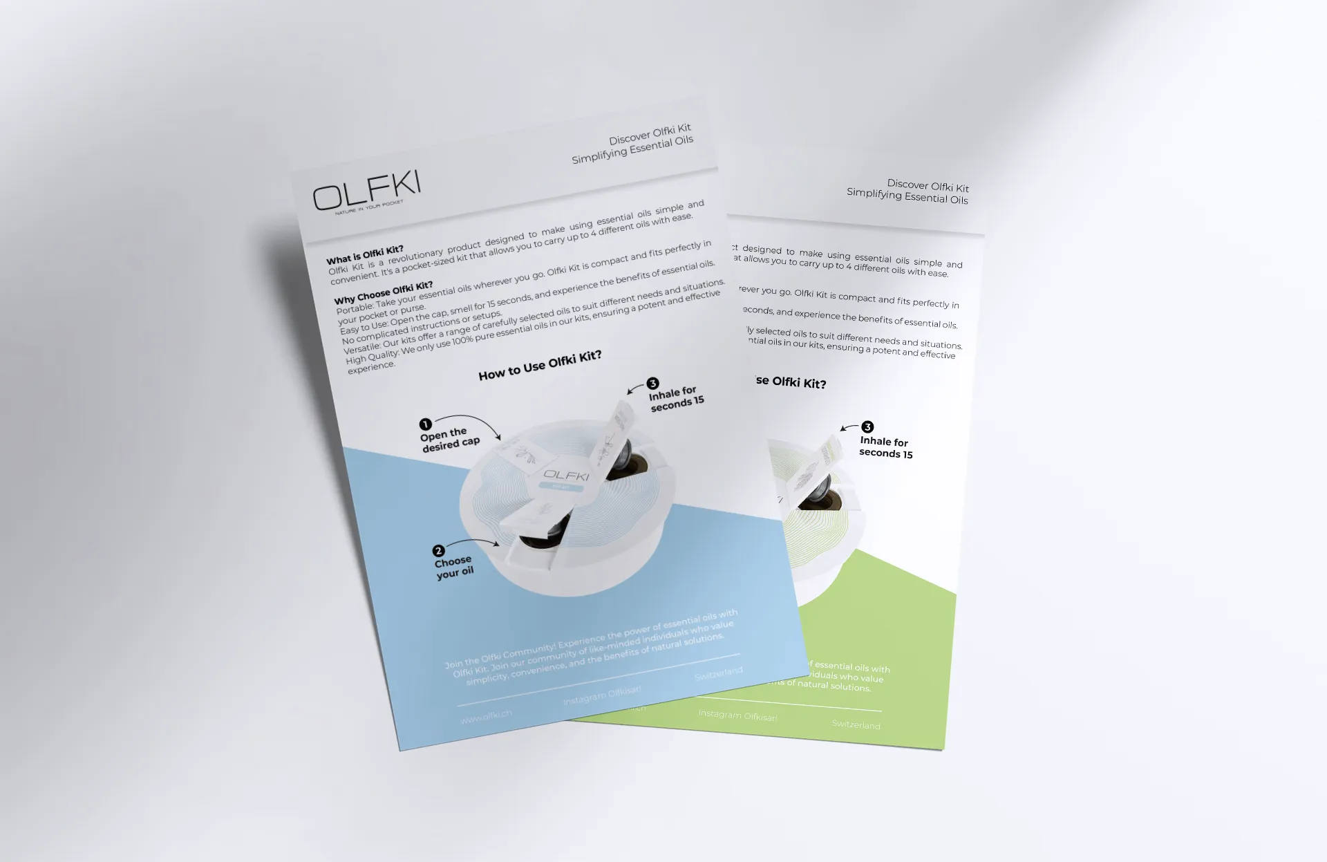
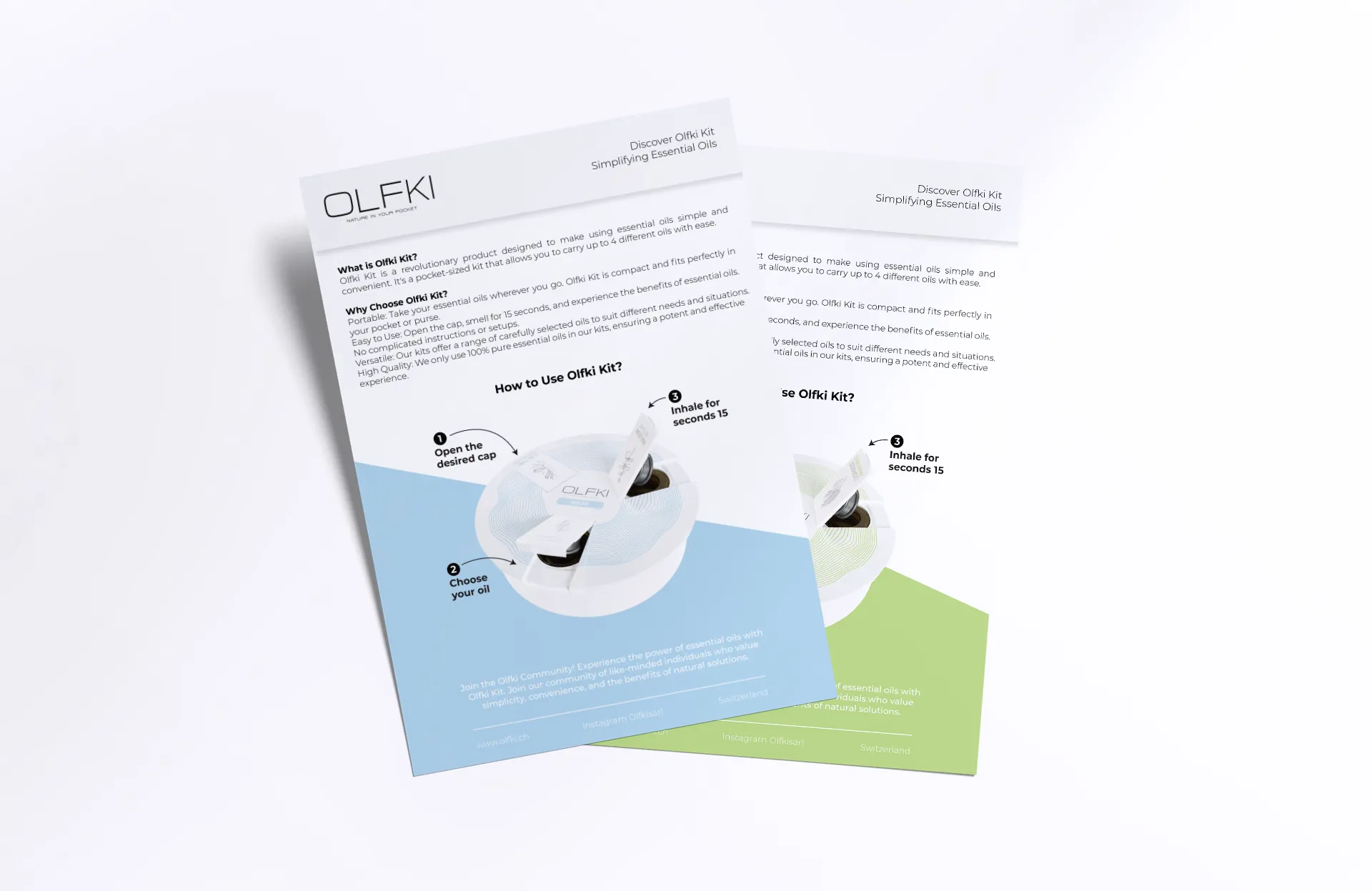
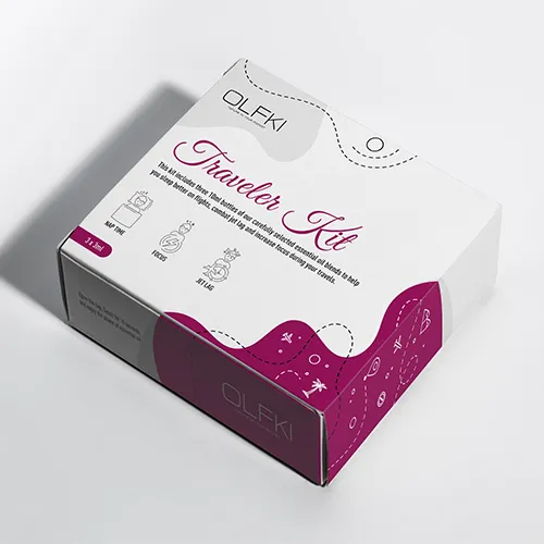
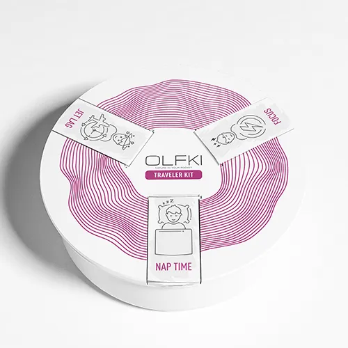
Every Olfki product label was designed to communicate the specific oil blend — using botanical illustration, precise typography, and a clean layout that works both at shelf scale and in close-up photography.
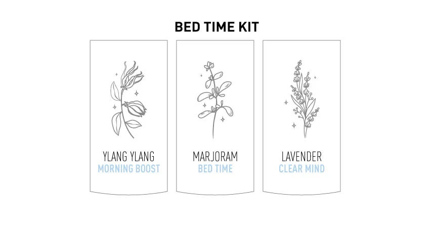
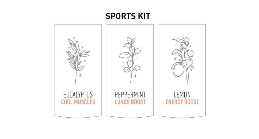
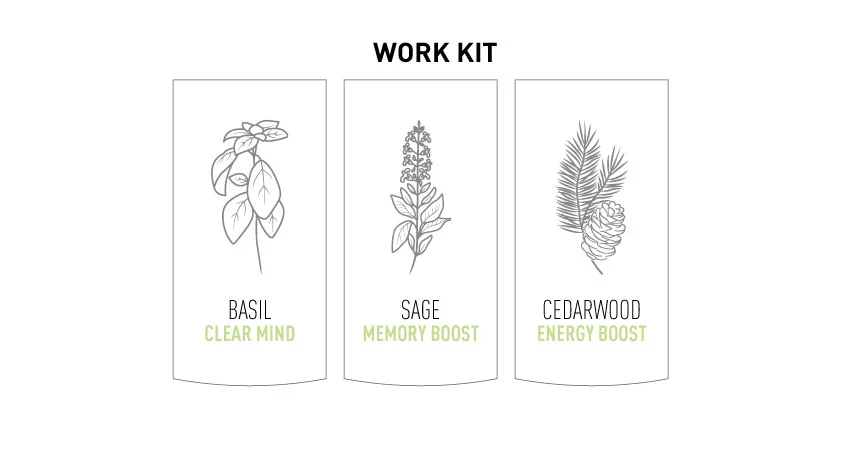
Product label series — each blend has its own distinct botanical visual language
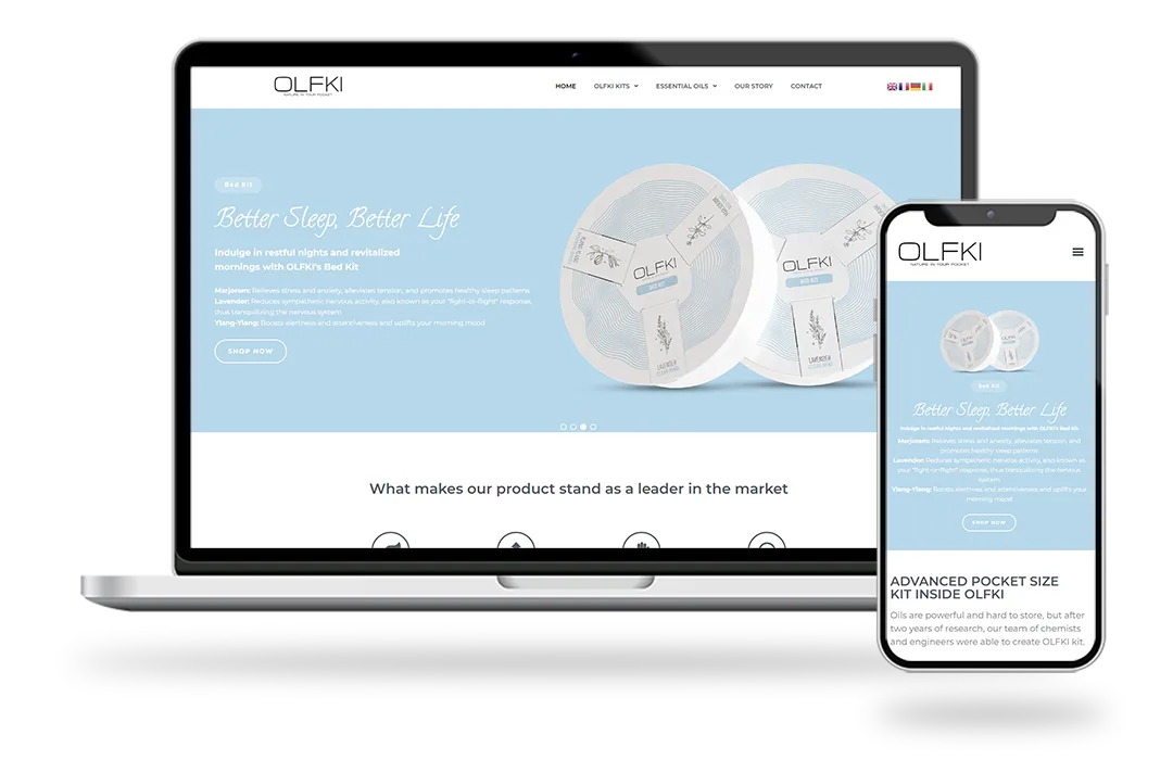
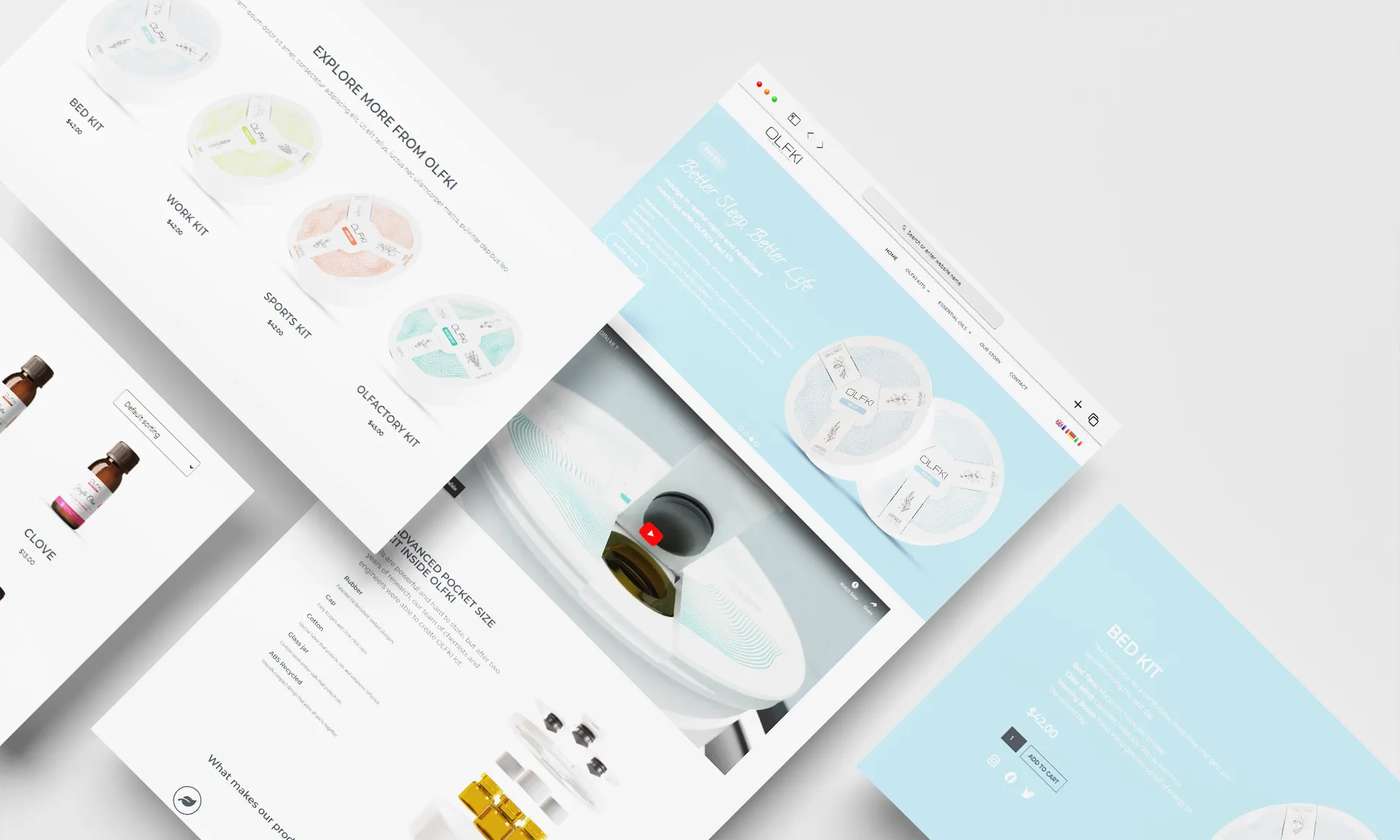
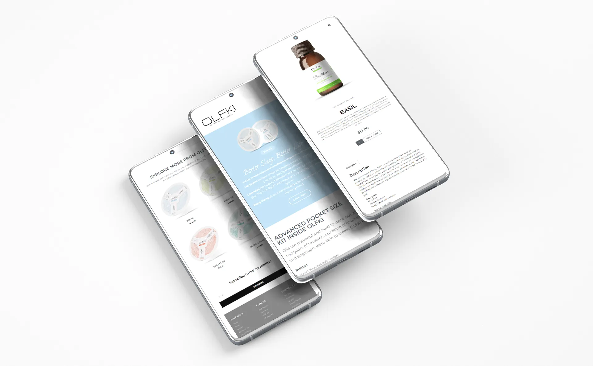
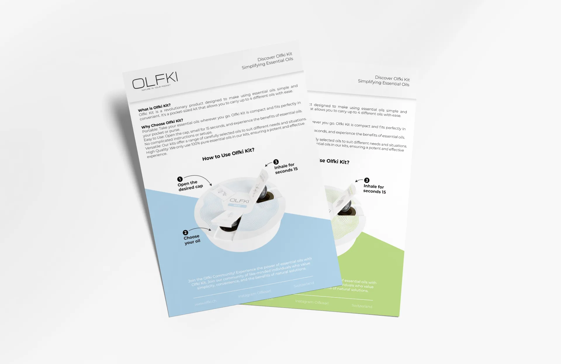
The Olfki website was built as a multilingual WooCommerce store — available in English, French, and Arabic — with product collections, kit builders, detailed ingredient pages, and a clean checkout optimised for both desktop and mobile.
See more of our work or get in touch to discuss yours.